Our Process
01. Listen to the client
02. Understand the audience
03. Develop the right look
04. Execute on the vision
Client Profile
Disruptors always have an uphill battle
Imagine entering a competitive market with a business model that flips the proverbial table on it's head. Dustin & Tara Johns from Resource Realty Group in Lexington, South Carolina did essentially that. How? Well, by suggesting home sellers were simply giving away their money unnecessarily in the sale of their homes under traditional listing commission fee structures based on a percentage of the sale price. They weren't pulling any punches with their domain name either, KeepYourEquity.com.
As you might predict, traditional brokerages & real estate agents trying to secure luxury listings primarily on the gorgeous Lake Murray didn't like this new way of thinking in the market.
To fill in some context, listings on Lake Murray in the Midlands region of South Carolina can easily justify a $1, $2, $3 or more million price tag. Assuming a 3% listing fee on a $3 Million listing, we're talking about a $90,000 pay day at closing. Now put yourself in their shoes when Dustin and Tara list any home for a flat fee. Not just any flat fee, but $2,800. Do the math again on that $3 Million listing... instead of 3%, we're talking < 00.1%.
Anyone that disruptive in the real estate market is sure to turn some heads. Doing it in a Luxury market on listings that represent new Porsche sports cars or dream vacations, They're bound to make some enemies.
They're also bound to make some very, very happy clients.
Our first job was to get the site KeepYourEquity.com back on message & working to counter-act the naysayers in the market suggesting 'flat rate' was synonymous with discount, bargain or sub-par service. Yes they're a client, but after seeing the testimonials first-hand, I know who I'd sell my home with.
before
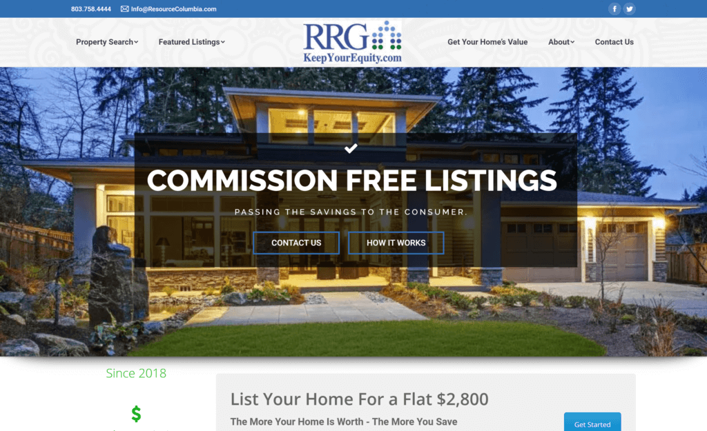
Main menu 1 & 2 both supported a buying motivated audience, not selling. The website is for sellers.
Marker 2Background texture made white background of logo obvious and appear amateur. Second, KeepYourEquity.com is redundant - perhaps explain what RRG stands for & what brand owns and operates the website.
Marker 3The first 'seller' motive navigation link and it routed visitors off the domain. What?! Entirely devalued the site and undermined it's purpose.
To appeal to sellers again, we needed to...
Correct the script to cater to listing motivated visitors.
Folks looking to sell their home fall into a few categories: first time sellers, for sale by owner inclined or convenience sellers. The Venn diagram of concerns overlap in some common ways, but differ in others. When a selling website decides to convey language for buyers & ignore those differences, it quickly dilutes the faith of selling motivated visitors.
Key areas this was a problem
• Global areas like header & footer
• Homepage 'above-the-fold'
• Misuse or Under-Utilization of available technology site-wide
Part of the claim being made by RRG was that they were using technology more efficiently & had a process in place that made their flat rate listing fees realistic & a viable business model. While this is true, the website had numerous places where the design didn't feel modern or all that advanced technologically. Additionally, evidence of the flat rate listing fee working for other sellers was mostly hidden.
Both of these factors gave room for visitors to question the claim and put it in the 'too good to be true' category of their minds. Many of these decisions were being made in the first few seconds of arriving to the website. That needed to change.
Key Reminders:
A. Audience of Sellers
B. Goal to attract more conversations about Selling with RRG
C. Point of Differentiation = Flat Rate Listing Fee
Attraction Narrative:
Save Your Home Equity when you sell (via...)
RRG Flat Rate listing fee over Traditional Broker % based fee
Imagine you're participating in a focus group
Following a quick 15 second glimpse of the homepage of each version of the website... The administrator asks you privately, "what is the main idea of the old site vs the new site?"
I suspect answers would be very similar. Roughly, "...listing your home for a flat fee"
Next, imagine a follow-up question, "Which site design is most believable or trustworthy? Which design builds more confidence that it can achieve the claim?"
after
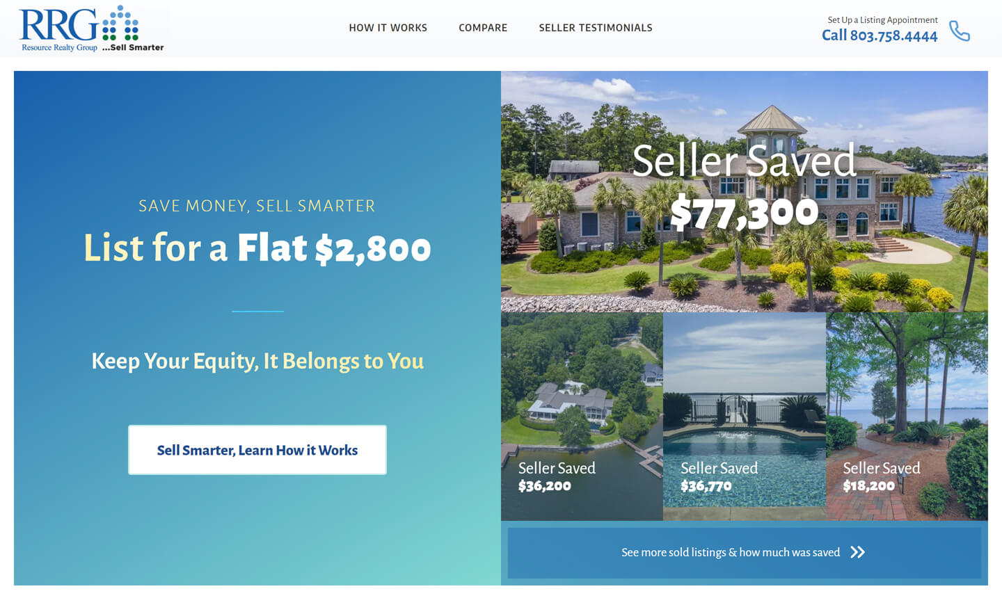
The 'Sell Smarter' slogan is more than just a slogan, it's self evident when you pursue the fair comparison of traditional vs RRG flat rate listing fee structures.
Marker 2No hidden links behind drop-down navigation. Hiding the best evidence for your value proposition goes against best practice fundamentals in web design.
Marker 3What the predecessor design left out was evidence or for that matter, any invitation to pursue the evidence. The re-design made showcasing evidence a primary objective.


Know Your Audience so you can speak effectively to them & show them what the new generation calls 'receipts' ... the Evidence.
Connecting with the right audience...
The success of the project to prune back & bring focus to the main navigation centers of the site, in the header & footer. Phone number was good but could be better, email in that sort of placement rarely gets used, socials up top invited visitors to leave too soon... you get the idea.
It was important in the next design to make the phone call to action clear for the quick contact motive users. For the browsing motive users we needed to encourage time be spent on keepyourequity.com not elsewhere.
Because the goal was to engage with sellers, we needed to address their concerns through our script. It's important not to fall asleep at the wheel on this either. Just because we have it set correctly today, doesn't mean seller worries won't shift in the future. It's a top-level concern we all must keep a finger on the pulse of, or the site risks growing stale once again.
Keeping the audience with evidence...
Once you have the attention of an audience, it's up to you to maintain it. The great thing about presenting evidence & reinforcing that evidence with trust signals like awards, leadership credentials, well written biographical copy is that it serves dual purposes. It too has attraction capabilities. Seeing evidence of success is one of the most magnetic tools in marketing - which is why testimonials and peer review is so powerful on sites like Yelp, Google or Amazon.