5 Examples of Eye-Path Pitfalls that Hurt your Website Conversion Rate
Eye path is one of the most important elements in landing page design. When elements on a webpage cause visitors to stumble, become lost or even think too much – you are losing out on sales. Your page must be able to systematically guide your visitor’s eye to the action you want them to take. It must show them exactly what you want them to do without making them have to think about it; Because they moment they say to themselves “what next”, you lose.
An eye-path is simply a way to lead your visitor through your page in a clear order which makes sense. Ideally, you want to tell a visitor right away – where they are, what they can do on the page and why they should do it. The answer to “what should I do here?” should be related to your clear, concise, call to action.
All of the following examples were taken from PPC ads just this morning. It doesn’t take long to locate some good examples of bad landing pages.
Objects that compete for your visitor’s attention
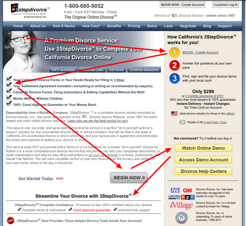
This is by far the most common landing page design mistake. Visitors should immediately be able to understand where the call to action is on a page – whether it’s a button or a banner, it should be glaringly obvious. If you have more than one offer on a page, you are making a person have to stop, think and choose. If you have an offer and other elements on the page that compete with the offer visually, you will also run into issues with eye path confusion.

In this example we have multiple colors, buttons, banners, fonts, logos, an auto-playing video and if you scroll down just a little bit, below the fold there are arrows, arrows, everywhere! Where does one look with all these things competing for attention? The button to get an iPad is almost buried amongst the other elements. If the offer on the page is not instantly clear, not many people are going to stick around to figure it out.
Fonts that yell, scream and shout “Look at me!”, “No, Look over here!”, “No, here!”
If you use more than 1 font family on your page, you might be asking for a challenge; If you use more than 2, you’re asking for trouble. Font usage can cause the eye to jump from one place to another, which can be a good thing when done right. When done wrong, it can be perplexing.
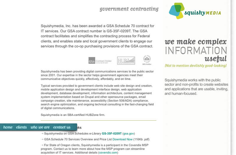
This example touches on more than one of these eye path issues. When I got to this landing page, the navigation bar seemed to be broken, but even with it working properly, I couldn’t help but wonder why the choice was made to put the main page heading to the right side and use so many font treatments. I know, it’s a design firm and they have the right to some creative freedom, but would a government employee landing on that page for the first time “get what’s next” and be compelled to move further along in the sales process? Highly doubtful.
Elements on the page that are out of order
Headlines and any graphic elements should follow a hierarchical order. People are trained to do some things naturally, like reading from left to right (in most countries anyhow). If you have headings that follow a certain pattern, that’s fine, but when you throw in random bold headings in various places, it causes the eye to skip around. Likewise, adding boxes that almost cause your eye to completely stop, should be reserved for the call to action.
Searching for a divorce attorney (no, I’m not really searching for a divorce attorney 😉 ) – in this competitive niche, I found this example of headings that cause your eye to jump from place to place. Aside from the other elements on the page that do the same, the headings that have equal sizing and weight are competing with one another for attention.
Too much good stuff all in one place
I know, your product or service is awesome and you want to squeeze in every juicy detail about it! Don’t do it. If you have a very complex offer, you may consider creating a mini-site, whereas there are links to different areas of the page that explain complex details. Throwing everything on one page creates clutter that’s difficult to weed through.
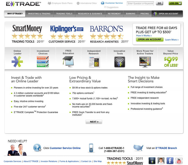
In this example I searched for “buy stocks” and among this very competitive phrase I found the PPC ad for this company leading the charge with the most expensive ad possible. Yes, they have a brand and yes, they likely have a large marketing budget, but those things don’t add up to a clear, concise landing page. The button that says “Open an Account” looks like it was almost an afterthought, as the size is quite small in comparison to other elements on the page. I can’t decide what they are saying is most important here – is it their ratings? Or all the goodies you get (I think those are goodies)? Where’s the offer?
Calls to action that don’t call anyone to take action
If you’ve paid good money to get eyeballs to see your landing page, make sure that what you want a visitor to do there is clear in relation to the source of the traffic. So, if you bought a pay-per-click (PPC) ad that is specific to a certain topic or need, make sure your landing page speaks to that audience directly.
In this landing page example, the company was paying for PPC ads, but once on the landing page it was easy to get lost. The company doesn’t clearly state what a visitor should do once they are on the page. There are many informative links leading all over the place, but as a visitor you are forced to really dig to find a way to contact the company or request information. “Contact us” isn’t the best call to action, but it’s better than nothing!
In conclusion: Keep landing pages as simple as possible
The more you add to a page, the more likely it is that you will run into eye-path issues. As always – Test, test, test! You really can’t test enough. I highly recommend split testing landing pages to get a clear understanding of what works vs. what doesn’t. Choose what you add to your landing pages wisely and always remember “Don’t make visitors think.” Less is always more in landing page design.
Oh, and hiring an awesome internet marketing company can’t hurt 😉
Note: While this article was originally written in 2011 and the examples cited may look even more dated than they did back then, the advice given still holds true a decade later.

Author
Samara Hart
Digital marketing strategist with over 15 years experience strategizing and managing Google Ads, Facebook/Meta ads, and peripheral networks. Increasingly, "big tech" ad networks are overreaching and looking to make gains at the expense of advertisers. It is my job to bridge the gap for my clients and generate the highest possible ROI without wasted ad spend. I work in my client's best interest, not Google's or Meta's. Contact Me or Follow me on Twitter